Analytical statements
culled from
Albers' extensive
writings
accompany each framed
unit of 2
prints
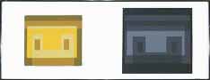
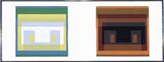
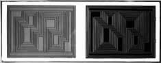
I:1
The two contrasting constructions
demonstrate
a shifting away from an "only-one-way" of reading visual form to a
"multiple"
reading of the same image.
Presented are two stairlike
figures, a large
one at right, a small one at upper left. They consist of three,
or
two and a half, steps built of vertical and horizontal planes which
appear
translucent or transparent.
The large figure, normally, is seen
first and
read upward, because its lower step is largest. It also overlaps
both the connected horizontal plane (seen from underneath) and the
front
of the second step, which is equally related to the following, the
third
step. Therefore, the upward reading of the large figure repeats
three
times a moving up, followed by a backward down.
I:5
Two versions of Homage to the
Square.
A quartet of four voices which are reversals of each other and which
present
extreme contrasts in sound and mood. Reading them in opposite
directions
invites one into a clarification of
various ways of reporting nested
colors.
The nonpainter usually notices the
outer color
first. The painter, since he must paint the central color first
and
the next color neighbor next, normally reads the outer color -- last.
Some spectators are led to notice
their preferred
color or colors first. Others begin with "firsts" in quality
(i.e.,
high intensities in light and hue) or "firsts" in quantity, measured
either
by extension or recurrence. Sometimes grouped colors (as the two
blues here) get immediate attention.
When it comes to reading advancing
and receding
color, there will rarely be agreement -- regardless of convincing
decisions
offered by theories based on color temperature or wave length.
I:6
Four upright rectangular
backgrounds (taken
from folder I:5). Each of these carries the same design (from an
early glass picture), which consists of overlapping and penetrating
groups
of horizontal lines and blocks which we read vertically up and
down.
The color in all four cases is precisely the same middle gray.
This
appears dark at the far left and light at the far right, and on the
second
and third grounds appears somewhat metallic, with a yellowish and
reddish
tinge.
I:9
Two of three developments of an
oil, Vice Versa,
1943, belonging to the Biconjugate, or "double-centered,"series.
Left: Very thin, almost
transparent grays.
Right: In reversed order of
light, in
emphasized heavy grays.
I:12
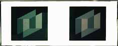
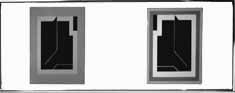
Two "pianissimo" constructions in
extra-thin
white lines on extra-light gray grounds. We see twin pairs of
exactly
reversed open prisms, reaching equally above and below each other.
In each pair the upper right-end
walls and
the lower left-end walls are missing. Missing also are the
coverings
over the top walls and under the bottom walls. On both sides,
between
the upper and lower open boxes, there are sideward-stretched
parallelograms
of equal size and equally placed. These parallelograms fulfill two
functions.
They are, simultaneously, the bottom of the upper prism and the top of
the lower prism, according to our direction of sight. Thus we are
confronted by two spatial penetrations. Although all lines exist
physically in one two-dimensional plane, in our perception we read
this
unavoidably in three dimensions.
I:13
A development through six years
(1936, 1941,
1942).
Left: A line construction of
two very
different halves. Four thin verticals raise two, three, or four
foreshortened
horizontal rectangles to various levels. Within the right half,
six
thin slanting parallels invite one to make a relationship of some
corner
points of a mostly vertical structure to each other or to the left
half.
This, all together, produces a challenging confusion. That was
1936.
Right: The two colors,
off-white and
light gray, enter the inner shape of a similar drawing to the one of
1936.
The additional black surrounding the grays makes the left definitely
appear
carpet-like (flat) and the right half (still flat) distinctly standing
upright. That was 1941.
I:14
The afore central figure (folder
I-13, right)
is almost completely surrounded by a deep gray which again lifts the
left
half up two levels and on the right changes the high upright face to a
three-dimensional large head. The additions of near light red
against
the bottom, a more distant deep red above the central figure, and a
pink-violet
border framing the whole complete an unusual composition. That
was
1942.
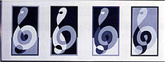
I:16
Four different temperaments of a
very first
group of serial variants, derived from and named after an elaborated
G-clef
(or treble clef or violin clef), started about 1931 abroad and ended
about
1935 in the United States. These were developed mainly in
so-called
colorless colors -- various shapes of gray plus black and white.
These show that any shape permits
and invites
various readings, which are caused by changing associations and
different
reactions and which result all together in a change of meaning.
Such changes of meaning depend on
altered relationships
of the parts of the compositions, on changing contrasts and affinities
(different groupings), on placement, and on more or less concentration
or emphasis. All together, this changes the direction of our
reading
of the content of the pictures. This is where we begin and end
our
wandering through the picture, where we return to or meet again.
On this journey we notice, first and most quickly, the large before the
small, the loud before the soft, the bright before the dull; in short,
all increased or intensified qualities and activities. Compare,
for
instance, each of the lower parts of the figures -- the "torso".
All are of different character though precisely of the same
shape.
They even appear of different size, extension, weight, and density, and
the movement of the spiral of different speed, swirling more outward or
inward, increasing or decreasing in tempo, looking more flat or more
oblique,
and so more dynamic or more static. (From an early commentary for
a slide lecture.)
I:17
Two closely related Variants based
on one of
nearly twenty developed on an underlying grid that offers an
opportunity
to develop the image with exact equal quantities of the colors.
The
color instrumentation used here may remind one of a early color climate
of the early Florentine School.
I:18
Two samples of curved compositions
originally
executed in sandblasted glass pictures. At the left, The
Impossibles;
at the right, Rolled Wrongly (originally Falsch Gerickelt). On both
sides
are pairs of straight upright creatures most unusually rounded and
curled.
Developed in 1931 as mostly white figures against black or gray, forty
years later those underwent a drastic change in coloration, although
the
figure designs have remained precisely repeated. All four figures
appear in a light but restrained red-orange on a dry brown-red (either
Venetian or Indian Red) ground. The curves are articulated in
black,
and the vertical modulation lines in the color of the ground. The
whole, now, may be in a mystic stage.
I:19
I:20
A very light optical gray, in each
case amidst
three light yellows, appears blind, bluish, and dark.
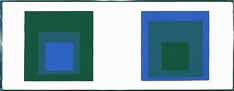
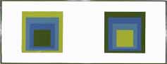
I:23
Although without any obvious color,
this assembly
of four quartets of Homage to the Square, executed only in grays,
presents
a manifold tonality.
I:24
Analyze contrast and affinity
within one color
trio.
I:25
From oil of 1940, Bent Black.
On tiptoe
and pendant between points.
I:27
This shows a construction that is
based on
a geometrical relationship. If you draw a horizontal axis, in
reading
from left to right you will realize that the width of the passe-partout
is the measure of an underlying pace, which can be compared with the
beat
of musical compositions. It defines the subdivision of the two
figures
and their distance from each other, as well as the paper margin.
With this, the rule is recognized as a composition tool.
A diagonal drawn from the left
lower corner
of the figures to their right upper corner will show also that the
corners
are in a definite relationship, though sometimes outside of the
composition.
In this way, we can draw several diagonals and so prove that no point
of
this construction is arbitrary. Every part of the whole construction is
distinct by an underlying structure. (From an early commentary
for
a slide lecture.)
I:28
Occidental and Oriental -- color.
I:30
Again, two contrasting Variants.
Left: Mostly yellow with
gradations of
light -- probably "morning."
Right: No color, little
light, no temperature
-- possibly "timeless."
I:32
Two new versions of Prefacio, from
the Graphic
Tectonic series of 1942. (Originally on white paper, shown here on
gray.)
Left: Black on gray
ground. Here
all horizontals appear lighter than the verticals.
Right: We reversed further,
to gray on
black, and this time the heavier lines appear lighter.
Comparing left and right: The
steps leading
to the openings are lighted at the left from above and from below, or
in
cartographic reading, by North and South light. At the right, the
light centers from West and East. Thus art is trying anew to do
more
than nature: two polar lighting directions at the same time.
I:33
A reversal of Seclusion, also from
the Graphic
Tectonic series.
The amassed white horizontals (at
bottom, center,
and top) appear whiter than the thin white verticals, just as the
upright
black rectangles (in the lower and upper half) seem darker than the
black
between the white lines. And left and right from the center,
thick
and thin white lines resulting in small triangles cross the whole --
still
whiter and sometimes even indicating color. Physically, of
course,
all whites are the same and are the white of the paper. As to the
black, only one ink has been used. But in our perception there
appear
different whites and different blacks. Thus we see all whites advancing
from the black, though they are physically empties and are thus lower
than
the blacks.
II:1
As in Portfolio I, we start again
with Steps
in order to be reminded of the important shift from a "one-dimensional"
to
a "multiple" reading. We use a
parallel
order with the same design, changing the four blues of folder I-1 to an
off-white and two middle grays plus deep gray. Because the
darkest
color dominates at the left and the lightest color at the right, we are
tempted to see the grounds as being different as well.
II:4
II:5
Two versions of Homage to the
Square, which
could be said to indicate two phases of outdoor light under a gray sky
-- merging at left and culminating at right. When seen in II-5,
the
juxtaposition appears independent of nature -- noon and dusk now touch
each other as great contrasts. The result of this is a strange
color
interaction, particularly seen within the three lower colors.
II:6
From a construction of 1944,
Fenced, originally
a linocut. Here seen in thin and heavy straight lines. On
the
left the ink used is black, and on the right, violet-brown. The
heavy
lines appear in three large and one small field. When we observe
the right print more closely, we see that the areas containing the
heavy
lines look surprisingly as if they were printed in straight black, as
if
the same ink were used on both sides. Now, looking back to the
left
print, the areas with thin lines and the empty area at the top appear
suddenly
-- violetish! We have no explanation for these changes.
II:8
ON MY HOMAGE TO THE SQUARE
Seeing several of these paintings
next to each
other makes it obvious that each painting is an instrumentation in its
own.
This means that they all are of
different palettes,
and therefore, so to speak, of different climates.
Choice of the colors used, as well
as their
order, is aimed at an interaction -- influencing and changing each
other
forth and back.
Thus, character and feeling alter
from painting
to painting without any additional "hand writing," or so-called texture.
Although the underlying symmetrical
and quasi-concentric
order of squares remains the same in all paintings -- in proportion and
placement -- these same squares group or single themselves, connect and
separate, in many different ways.
In consequence, they move forth and
back, in
and out, and grow up and down and near and far, enlarged and
diminished.
All this, to proclaim color autonomy as a means of a plastic
organization.
(From an early text.)
II:9
Two Variants: Climate --
Northern and
Southern.
II:13
II:14
A collaboration between three
alternating hard
- and soft - edged, dark green Homage to the Squares and one which is
extra
citric and ripe.
II:16
Observe that a prism fits
geometrically into
a square and thus constructs the letter Z -- and "see," if you can,
that
the Z on both sides contains the same middle gray.
II:21
Within the same contour, two
different and
monumental linear constructions. The outer contour is repeated;
the
inside functions are reversed.
II:23
Two versions of the same
Biconfugate:
Indoor and Outdoor.
II:25
II:26
Here, more emphasis on "perceptual
ambiguity,"
as the psychologists call a spatial illusion with several reading
possibilities.
The two light gray shapes above and below
the central zig-zag wall can be read
either
as receding --
in which case there is an empty space
between
them and we look into it either up or down -- or as ceiling or
floor.
More surprising is that the two heavier grays, which appear first as
distant
backgrounds, turn near the lower left and upper right corners, suddenly
to become solid volumes. Such illusions are not possible in
three-dimensional
reality. They are a privilege of two-dimensional design.
(From notes for a slide lecture on
Indicating
Solids, 1948)
II:27
II:28
After these eight Homage to the
Squares, all
only in reds, see that the four squares of the same size (see folder
I-23)
in grays are no less appealing.
II:29
Two Variants in the same
palette. At
the left the gray submerges although it enclose the center; at the
right
the
gray dominates the center.
Without comparison and choice there
is no evaluation.
And why are we afraid that thinking and planning -- necessary in all
human
activities -- will spoil painting? The saying that
the freshness of the first sketch
cannot be
repeated -- is admitting impotence.
Again we need -- in art as in other
human activities
-- more than mere self-disclosure (usually but wrongly called
self-expression)
or entertainment of starting effects and exciting accidents.
From paint to painting seems a
small step.
It is so only orally and aurally. Instead, it means a change from
colorant to color.
Take, for instance, pure
Viridian. As
long as it presents
itself just as Viridian, it remains a
colorant,
that is, paint.
As soon as it becomes questionable
whether
it is pure, tinted, shaded, or mixed with other colors, and as soon as
it appears perceptually not there, where it wants to stay, it changes
from
paint to color. This change is the result of relatedness.
In
a painting, this happens when color in a mutual give-and-take with
other
colors (or other formative means) does more or less than it wants to do
independently; namely, when interdependence results in contrast and
affinity,
both of which can go beyond all so-called harmony.
Consequently, in painting, the
physical properties
of color are of less interest than the psychic effect. What color
is is of less concern than what it does. Painting is color
acting.
The act is to change character and behavior, mood and tempo. An
actor
makes us forget his name and individual features. He deceives us
and functions as another than himself.
Acting, and therefore active, color
loses identity,
appearing as another color, lighter or darker, more or less intensive,
brighter or duller, warmer or cooler, thinner and lighter or thicker
and
heavier, higher and nearer or deeper and farther away; opaque turns
translucent,
joining colors appear overlapping each other. When color acts, we
never can tell what color it is. The ratio of effect to effect is
decisive in science, industry, and business, in politics and what it
may
lead to. Why not in Art?
As equality is nonexistent,
physically and
mentally, the principle of equal possession remains utopia.
As the center of interest shifts
from having
to being, from static possessing to dynamic acting, psychology is
getting
ahead of economics.
This has been recognized and
demonstrated in
leading branches of art today, namely, architecture and
typography.
There simplification and intensification have been applied as
a remedy against an increasing and
unbearable
complexity of living, where, after a naked economical functionalism,
the
value of esthetics and the meaning of form are recognized again.
So economy, again, is a principle
of action
instead of possession.
The ratio of effort to effect is a
respected
principle of construction in engineering. It should be considered
a measure for all planning.
Therefore, I apply it in my
teaching of design
as well as in developing my own compositions and constructions.
This
principle functions not only as a measure of economy but, more
important,
as a means of discipline as well as of simplification, intensification.
I know such considerations frighten
those believing
that art springs mostly from the subconscious. I believe that
thinking
is necessary in art as everywhere else, and that a clear head is never
in the way of genuine feelings, but of so-called feelings, which,
unfortunately,
are too often prejudices.
J.A., 1949. (From
Ives-Sillman:
Ten Variants, 1967).
II:31
After two early sandblasted flashed
glass pictures.
II:32 THE COLOR OF MY PAINTINGS
II:33
They are juxtaposed for various and
changing
visual effects. They are to challenge or to echo each other, to
support
or oppose one another. The contacts, respectively boundaries,
between
them may vary from soft to hard touches, may mean pull and push besides
clashes, but also embracing intersecting -penetrating.
Despite an even and mostly opaque
application,
the colors will appear above or below each other, in front or behind,
or
side by side on the same level. They correspond in concord as
well
as in discord, which happens between both, groups and singles.
Such action, reaction, interaction
-- or interdependence
--
is sought in order to make obvious how
colors
influence and change each other; that the same color, for instance --
with
different grounds or neighbors -- looks different. But also, that
different colors can be made to look alike. It is to show that 3
colors can be read as 4, and similarly 3 colors as 2,
and also 4 as 2.
All this will make aware of an
exciting discrepancy
between physical fact and psychic effect of color.
But besides relatedness and
influence I should like to see that my colors remain, as much as
possible, a "face" -- their own "face," as it was achieved -- uniquely
-- and I believe consciously -- in Pompeian wall-paintings -- by
admitting coexistence of such polarities as being dependent and
independent -- being dividual and individual. (An early
statement.)
 Josef
Albers was one of the 20th Century's most influential and articulate
artist/theorists.
Formulation: Articulation is an overview of Albers' life-time
oeuvre.
Published in 1972 by Harry N. Abrams, New York, the works were chosen
by
Albers himself and produced in silk-screen under his supervision by
Ives-Sillman.
Josef
Albers was one of the 20th Century's most influential and articulate
artist/theorists.
Formulation: Articulation is an overview of Albers' life-time
oeuvre.
Published in 1972 by Harry N. Abrams, New York, the works were chosen
by
Albers himself and produced in silk-screen under his supervision by
Ives-Sillman.