SAM GILLIAM:
HIS ART OF PRINTMAKING
Exhibition Essay
By Bruce Weber, Independent Art Historian |
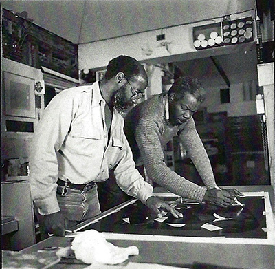 |
Sam Gilliam with master printer Lou Stovall
with whom he worked for over 40 years.
|
|
Sam Gilliam (1933-2022) expanded the language of abstraction in continuously new and surprising ways. He embraced an astonishing medley of styles and media and vigorously tested the boundaries between painting, sculpture, and printmaking. “My formula has always been one of change . . . . ,” Gilliam remarked. “It’s really a matter of confidence and of gut instincts. I’ll take a chance on losing everything in order to gain something else.” The art historian, curator, and educator John Beardsley commented that “Gilliam’s approach to printmaking is as unbound as his approach to painting, so to summarize it is difficult. . . . Gilliam will try almost anything you can think of, along with a good many things you can’t. . . . [H]e [is] ever more able to astonish, not only technically but chromatically and compositionally . . . .”
Gilliam was a master at manipulating print material. He sought to take “the amount of freedom really necessary to bring a print to conclusion” and believed that the “great thing is to make the press work experimentally.” He believed that things “start to happen when the master printer” works in conjunction with the artist’s knowledge and spirit of invention. He created his prints entirely by his own hand rather than from pre-existing imagery. They grew out of what was happening in other areas of his work at a given time and often bear a formal resemblance to particular paintings or constructions. Beardsley noted that within an edition of prints all the works “might be organized around a single arcing form, while in another, all might be executed in varying shades of red or black.”
He frequently made prints to serve in fundraising platforms for civic causes or to assist in grassroots funding efforts. He employed such techniques as silkscreen, lithography, etching, woodcut, drypoint, aquatint, block printing, and monotype, often employing more than a single process to create an edition of prints. He also incorporated embossing, die-cut, and other methods of fabrication, and also applied rubber stamps. In the 1980s, he began to create three-dimensional constructions made of fabric, collages, and other materials. Art historian and former curator of special projects at the National Gallery of Art Ruth Fine once observed that Gilliam’s additive prints “both exploit and defy traditional printmaking methodologies as they extend his visual language.”
In the early 1970s. Gilliam began extensively incorporating printmaking techniques into his practice.. At this time, he started creating prints in collaborative workshops across the United States. The printers he worked with helped him pull “the work together because I find that it’s not work alone. It’s sometimes freshness, and environment of a particular place, that sort of wakes you up and allows you to do things . . . to bring something back [to the studio] to work with. . . . Working with people [means] you [have] spent half the night talking about . . . philosophies and various things.”
At first, Gilliam was apprehensive about producing prints because he had never formally studied printmaking. Once he became involved, however, he quickly picked up techniques and styles and came to value the printmaking process as a major way to explore new ideas. Gilliam discovered that it enabled him to try things out more quickly than in painting, and he appreciated that prints retained “the experience of drawing more than paintings do.”
In 1971 and 1972 Gilliam worked with George Lockwood and John Hutcheson, producing lithographs at Impressions Workshop in Boston.. These were visually lush abstract images printed in thin areas of colors layered over one another. His interest in printmaking deepened during the 1970s as he worked with Lou Stovall at Workshop Inc. in Washington, D.C., and William Weege at Jones Road Print Shop in Barneveld, Wisconsin. Both Stovall and Weege were masters at translating into the print medium the bold colors, crisp line work, and fluid movement of paint that are hallmarks of Gilliam’s paintings.
With the support and guidance of the printers with whom he worked, Gilliam explored new ways of mark-making, creating and contrasting shapes, textures and colors, and using the pictorial language he had developed in his paintings, especially his floating geometric shapes—circles, rectangles, arcs, and triangles. The ground of his prints is crazed with forms resembling the pours, drips, specks, splashes, splotches, smears, daubs, drizzles, and dragged strokes that characterize his paintings.
| • • • • • • • • • • • • • • • • |
Sam Gilliam was born in Tupelo, Mississippi, in 1933, the seventh of eight children of African American parents Sam and Estery Gilliam. Gilliam recalled that creativity was a cornerstone of his life growing up, and that “Almost all of my family members used their hands to create . . . . In this atmosphere of construction, I too began to flourish” The family moved to Louisville, Kentucky, in 1942. After graduating from the University of Louisville in 1955 with a degree in art, he served from 1956 to 1958 in the United States Army in Yokohama, Japan. While there, he encountered an exhibition of the French artist Yves Klein’s blue monochrome paintings and was stimulated by that artist’s audacious experiments with new techniques and approaches to art. Honorably discharged from the army, Gilliam returned to the University of Louisville, earning an MA in painting in 1961. His teachers there included Charles Croudel, Mary Spencer Ney, and Ulfert Wilke, whose collection of woodcuts by Japanese and other artists sparked his interest. Inspired by the Bay Area figurative painters Richard Diebenkorn, Elmer Bischoff, David Park, and Nathan Olivera, he created a series of dark, muddy, and thickly layered figurative works bordering on abstraction.
In 1962, Gilliam married Dorothy Butler, a journalist who was the first black female reporter at the Washington Post. After settling in D.C., Gilliam was introduced to the Washington Color School, a loose contingent of artists that included Morris Louis, Kenneth Noland, and Thomas Downing, all of whom executed large paintings dominated by abstract fields of color, which were created by staining unprimed and unsized canvas with acrylic-based pigment. They used color to create and delineate simple geometric forms, which envelope the viewer in an immersive all-at-once experience.
Following the lead of the Washington Color School, Gilliam abandoned traditional brushwork and instead poured diluted colors directly onto the canvas. He experimented with staining, dripping, dabbing, and other inventive methods of applying paint. Gilliam’s brushless techniques included folding and draping the canvas before it dried, which resulted in colors intermingling and bleeding into one another. In the print GDS (1978),the vertical edge down the center between darker and lighter halves calls to mind the folded divisions seen in some of his unsized paintings.
Under the influence of the Washington Color School, Gilliam committed himself to exploring nuances of color, texture, line, and format, extending the technical givens of a chosen medium. He used fluorescent colors and aluminum powdered pigments to create evocative and richly atmospheric paintings. Gilliam authority Jonathan B. Binstock has noted that the artist contributed to the expressive and formal vocabulary of the Washington Color School the gestural intensity and all-over “controlled chaos” of the Abstract Expressionist Jackson Pollock’s liquid skeins of paint.
In 1968, Gilliam created his first of many “draped paintings,” his most significant and celebrated innovation. In these, he dispensed completely with stretcher bars and instead cascaded lengths of painted canvas in elegant folds, from walls as well as stairwells, gallery ceilings, and through facades of art museums, using rope, leather, wire, and other materials to suspend, drape, or knot the paintings. Art critic Peter Schjeldahl aptly characterized Gilliam’s draped works as drenching the eye in effulgent color. In 1973, Gilliam returned to concentrating more of his attention on the stretched canvas, and pressed forward with his emerging commitment to printmaking.
| • • • • • • • • • • • • • • • • |
The Michael K. and Marian E. Butler Collection includes most of the silkscreens that Gilliam and Lou Stovall created over the course of a half-century. Stovall established Workshop Inc. in Washington, D.C., in 1968 with the help of a Stern Family Fund Grant, which provided the finances to establish a printing studio. Stovall worked almost exclusively with silkscreen (also known as screenprint or serigraph) and made prints for more than eighty artists, including Gilliam, Elizabeth Catlett, David Driskell, Jacob Lawrence, Alexander Calder, Josef Albers, Robert Mangold, Peter Blume, and Lois Mailou Jones. Gilliam greatly appreciated that Stovall was never formulaic in his methods but, rather, pushed boundaries to produce the most beautiful prints he could achieve, in an effort, the New York Times’ Shawn G. Kennedy wrote, to “make art, through silk-screening, more accessible to more people, and to make it a more honorable and appreciated medium.” Stovall, in turn, admired his friend and collaborator as “one of the few artists who could work quickly and surely enough to invent an interesting format on the spot.”
Gilliam lived a short distance from Stovall’s print studio and, over time, they built a loose collaborative working arrangement. They began the process of creating a print by using whatever elements Gilliam brought in from his studio. Stovall contributed original ideas, tools, and new screenprinting techniques to achieve the desired results. He continued to use the squeegee, the primary tool traditionally used to push ink through the mesh screen and onto the paper, but added new effects, and experimented with a variety of brushes, towels, hardwood scrapers and water-thin stains and glazes in a quest for rendering soft painterly effects. Stovall’s son Will recently related his father’s method of cutting stencils with a unique screen filler solution. He would paint “on the overside of the silkscreen to make subtle changes in tone and gradation, painting over cut stencils in succession, each stencil adapted for a change in tone or shade.” Among Stovall’s most ingenious methods was using cotton balls to create brushstrokes and employing castor oil to break up the color so that the white of the paper showed through.

Sam Gilliam and Lou Stovall’s first print
Dance (Purple), 192 Serigraph, 42 x 28 in.
|
Gilliam and Stovall’s first print was Dance (1972), commissioned by the Arthur Mitchell Dance Company and the Kennedy Center in Washington, D.C. The print and its variants are dominated by combinations of colors: blue/purple, orange/purple, or red/purple. Purple was Gilliam’s favorite color. For him, it “had a depth. It’s . . . a romantic color. It’s royal.”

Sam Gilliam, T Shirt (Equal Opportunity Is The Law), 1973
Silkscreen, 29 1/4 x 21 1/2 in.
|
A year after creating Dance, Gilliam and Stovall produced EEO T-Shirt, one of a set of ten prints by ten different artists produced for the Equal Employment Opportunity Commission in the District of Columbia. Gilliam and Stovall came up with the clever idea of using a t-shirt to serve as the stencil for the silkscreen, with the title of the print as a bright red tag on the collar.

Sam Gilliam, Pantheon, 1984, Silkscreen, 38 c 28 in.
|
About 1980, Gilliam’s began to experiment with shaped canvases and would cut, rearrange, assemble, and stitch onto the printed canvas geometrically shaped sections culled from thickly painted canvases. The technique greatly expanded his experimental essays in color, shape, form, and improvisation. He adopted similar practices in his prints. In Much (1980), he created a heptagonal image in which individual geometric configurations make up the design and form a bold patchwork composition. Pantheon (1984) relates directly to his own “pantheon” series of shaped paintings of 1983-1984, which were usually executed with acrylic on canvas, collage and enamel on aluminum.

Sam Gilliam, After Smoke, 1985, Serigraph, 32 x 40 in.
|
In 1985, Gilliam and Stovall produced After Smoke following a successful collaboration they considered to be so “hot” that the silkscreen was smoking. The print was inspired by Gilliam’s painting On the Back of the Wind (1985, Museum of Fine Arts–Hungarian National Gallery), which features a similar design of bright overlapping and intersecting collage elements. After Smoke is an example of one of Gilliam’s more whimsical titles. The biblical-sounding Providence 6:36 (1999) refers to the departure time of a flight from Washington to Providence, Rhode Island. He began the print at the Rhode Island School of Design and completed it at Workshop Inc. The silkscreen is composed of a series of delicate and intricately cut sections saturated with radiantly colored shapes, forms, and lines.

SAM GILLIAM, In Celebration, 1987, Serigraph On Paper, 32 x 40 1/8 in.
|
In 1987, Gilliam worked with Stovall to produce In Celebration, commissioned by the Smithsonian Art Collectors Program to celebrate the opening of the S. Dillon Ripley Center in the National Mall. The surface resembles the raked face of many of Gilliam paintings, which were, in fact, created with the aid of a rug rake. By 1994, Gilliam incorporated a new tool to his printmaking kit, digital technology. In For Xavier (1990), Niagara on the Potomac (1995), and Think Tank (1996) he incorporated computer-generated images of raked painting strokes, which lend the prints a jaunty energy.

Sam Gilliam, For Xavier, 1990, Serigraph, 32 1/5 x 40 1/8 in.
|
For Xavier was commissioned by the attorney, civic leader and chief operating officer of Stevie Wonder Enterprises, Timothy Francis, in support of fundraising efforts at Xavier University, where his father, Norman, long served as president. The print was inspired by Gilliam’s sculptural paintings The Generation Below Them (1988-1999, Collection of Doug and Nancy Eiler) and Waking Up (1989, Hallmark Art Collection), both painted in bold colors with acrylic on canvas and enamel on aluminum and constructed with plywood structures.

Sam Gilliam, Niagara On the Potomac, 1995, Silkscreen,, 23 x 40 in.
|
Niagara on the Potomac was commissioned to support fundraising for the Corcoran School of Art Scholarship Fund. The silkscreen pays homage to the nineteenth-century American landscape artist Frederic Edwin Church’s awe-inspiring painting of Niagara Falls (since transferred from the Corcoran Gallery of Art to the National Gallery of Art). The title refers to the Great Falls region of the Potomac River, which separates Maryland and Virginia just west of Washington. Gilliam viewed great rivers as dynamic forces that elicit both fear and amazement, and he created many pictures inspired by waterways. Think Tank (1996) was created to commemorate the twenty-fifth anniversary of the Joint Center for Political and Economic Studies (Washington, D.C.) and is based on Gilliam’s plan for an unrealized three-dimensional mural with functional hinged doors, that he had hoped to undertake in the late 1990s for the atrium of the New Orleans Customs House.

Sam Gilliam, Journey Home, 2002, Serigraph, 31 x 50 in.
|
In 2002, Gilliam was commissioned to create theatrical sets for the musical production Journey Home, a collaboration of the Washington Ballet and the acapella group Sweet Honey in the Rock. The production premiered at the Kennedy Center’s Eisenhower Theatre and toured for a year. The radiant golden-yellow-toned silkscreen of the same title and year of the production was created as a fundraiser for the Corcoran Gallery of Art, which in spite of efforts to survive tragically dissolved in 2014 due to financial and management issues.

Sam Gilliam, ARS, 2003, Silkscreen, 29 x 20 in.
|
Gilliam’s silkscreen ARS (2003) was inspired by an untitled drape painting consisting of four nylon bags hung together in a slightly overlapping manner. To balance the print’s overall color and tonality, the artist introduced into the composition soft and subtle greens, blues, and grays at lower left. Lou Stovall’s wife, D. Bagley Stovall, notes that the “shaped pieces that Sam brought to the Workshop were deep, rich, color-soaked nylon. . . . To match each of Sam’s new applications of color, Lou developed new ways to paint/splatter/drip with an ever-changing number and mixtures of stencils always adapting the process to match Sam’s current style of painting. ARS was washed with ‘flows’ of color to capture the color stains in Sam’s painting. Lou used transparent colors with new methods in the use of hand-painted stencils.”

Sam Gilliam, Museum Moment. 2009, Serigraph, 32 x 40 in.
|
In early 2009, Gilliam and Stovall again contributed their talents to the Smithsonian Art Collectors Program to produce Museum Moment, one of the pair’s largest silkscreens. The title alludes to In Celebration (1987), their initial commission from the museum. Di Bagley Stovall relates:
Lou used “stippling” but modified the process to create softer edges. Lou delicately balanced the stencil mixture and the ink to reflect the three-dimensional aspects of Sam’s paintings. The print was built by using transparent color washes and by layering color on color with subtle changes in tone to build the carefully composed image. The technique allowed the splashes of color Sam created with brushstrokes in the painting to be captured in the print. The print was one of their biggest challenges due to the number of stencils and colors required. Nearly every area of the print had a slightly different style and color hue.
In 1973, Gilliam created his first prints with William Weege at Weege’s Jones Road Print Shop and Stable in Barneveld, Wisconsin. In the course of Gilliam’s many summer visits to Jones Road, the collaboration yielded a sizable body of prints, first for Off Jones Road Press and later for Tandem Press, which Weege founded in 1987 at the University of Wisconsin-Madison. Ruth Fine notes that Weege’s materials, “programmed with his unprogramatic attitude, present a dramatic contrast to Gilliam’s collaborations [with Stovall].” She further observes that the Stovall’s collaborations with artists concentrated almost entirely on silkscreen and he engaged “in considerable planning before starting a print.”

Sam Gilliam, Flowers #2, 1989,
Collage, woodblock printing, painting,
encaustic on handmade paper, marble constructions in wood frames,
36 x 36 x 6 in.
|
Weege encouraged Gilliam to freely combine media and printing techniques. The work they did evolved into collages, assemblages, and experiments with paper making. Their joint efforts included handmade papers with distinctive textures and color and incorporation of photographic methods. Among other works they collaborated on creating multidimensional collages with woodcut, encaustic, and other material, and alternating patterns, textures, and shapes, including Flowers #2 (1989).

Sam Gilliam, Untitled Original 1--Purple Antelope Squeeze Space II,
1987, Mixed Media /Assemblage, 39 x 38 in.
|
Untitled Original 1–Purple Antelope Squeeze Space II (1987) is the first editioned work created at Tandem Press. Gilliam initially sent Weege a drawing of the shape he wanted the paper to be, as well as a mold made according to these specifications. The initial image was a relief print that used carved woodblock elements and lithography inks. Gilliam next attached handmade paper collage pieces he had painted. A variety of printing techniques followed, involving inked and un-inked metal-relief plates, steel and zinc etchings, and aquatint plates. Gilliam hand-painted details on the surfaces to prepare them for their final printing while the inks from previous runs were still wet. Each impression bears a unique pattern because the artist placed the printing elements in different positions and inked them in a variety of colors.
Gilliam took his sculptural explorations to a new level of engagement in the 1990s with Island Press at Missouri’s Washington University in St. Louis. There he created works of dramatic size and scale, employing mixed media, handmade paper, and appropriated imagery. The artist also executed with the press prints of more intimate dimensions, including the collograph Lightning Bolt (1992), which was printed on blue handmade paper. (A “collograph” is a collage of materials of various textures glued onto a printing plate, which is generally made of a thin wood or cardboard.)
| • • • • • • • • • • • • • • • • |
For over forty years, Gilliam worked with Steven Anderson in Minneapolis, first at Akasha Fine Art and then at Vermillion Press. After meeting Gilliam in 1978, Anderson realized that he needed to “invent a process/technique that would result in the generation of an actual dimensional surface on the paper along with [Gilliam’s] signature ‘raking marks’ and color.” He successfully emulated the surface of Gilliam’s paintings by inventing a unique intaglio technique, which enabled him to place 250 to 300 grams of ink onto the print.

Sam Gilliam,“BB”, 1999, Monoprint, 16 x 20
|
Gilliam and Anderson created BB in 1999 on the occasion of the eightieth birthday of artist and printmaker Robert Blackburn. The silkscreen is part of the Celebration Portfolio,which includes sixteen prints in various media by Gilliam, Blackburn, Will Barnet, Lois Dodd, Gregory Amenoff, Melvin Edwards, Paul Resika, and others. Bob Blackburn’s initials appear in the print and recall Gilliam’s placement of the letter D at the bottom corner in his 1983 series of “D” paintings. The D is a reference to Sculpture with a D, the painted aluminum sculpture Gilliam created for the Davis Square subway station in Somerville, Massachusetts, on the MBTA Red Line, which inspired Gilliam to incorporate industrial materials and techniques in his paintings. Anderson relates that Running Rouge (2003) is a relief print with lithography, part of a series of unique monoprints that include the word running in their titles. For the series, Gilliam and Anderson reused plates from some of the first prints they had done together at Vermillion.
| • • • • • • • • • • • • • • • • |

Sam Gilliam, To Enter The Forest, 1981, Serigraph, 22 x 30 in.
|
Gilliam often worked with the Brandywine Workshop and Archives in Philadelphia, which had been founded in 1972 to provide opportunities in printmaking and other visual arts. In 1975, he became the workshop’s first visiting Artist-in-Residence. Over the years, he worked with Brandywine on editions of woodcuts and silkscreens. To Enter the Forest was printed in 1981 by Robert Franklin. At that time, Gilliam was making black paintings streaked with arcs and lines of different colors, bringing to mind dimly lit night skies. Gilliam also worked at the Fabric Workshop in Philadelphia in 1977, where he produced silkscreens with crinkled, bent, folded, overlapped, and highly translucent surfaces.
| • • • • • • • • • • • • • • • • |
Until his death on June 25, 2022, Sam Gilliam had for more than fifty years pushed the boundaries of printmaking and continually redefined what it means to be a printmaker. He moved from experimenting with lithography and silkscreen to producing three-dimensional constructions using a variety of printing techniques and materials, including paper, fabric, collage, and more. All the while, his prints continued to evolve directly from what was happening pictorially and formally in his paintings and constructions. By the later decades of his long life, Gilliam’s printmaking process had become so complex and elaborate that his collaborator William Weege admiringly proclaimed that there could be “almost no way to reconstruct the creation of [Gilliam’s] prints, so many were the means.”
- Bruce Weber, April 2024
I would like to thank Will Stovall, Steven A. Anderson and Jonathan P. Binstock for generously sharing their knowledge and thoughts on Sam Gilliam’s activity as a printmaker.
Gilliam is quoted in Daniel Grant, “Gaining Self-Confidence and Patience,” American Artist, 54 (November 1990): 14.
John Beardsley, “Sam Gilliam: Recent Monoprints,” essay in Sam Gilliam: Recent Monoprints (Philadelphia: Brandywine Workshop, Printed Image Gallery, 1993), p. 7.
Ruth Fine, “Sam Gilliam: Imprint and Improvisation,” essay for Sam Gilliam: Prints from the Artist’s Collection (Washington, D.C.: The George Washington University and Luther W. Brady Gallery, 2006), n.p.
Gilliam is quoted in Jonathan P. Binstock, Sam Gilliam: A Retrospective (Berkeley, California: University of California Press, 2005), p. 4.
In 1966, Gilliam began to pour and manipulate paint in entirely new ways, sagging the canvas into a frame, and using it as a vessel for paint. He soaked his canvases with thinned acrylic paint while they lay on the floor, and extended the technique by folding the canvas back over itself after wetting it with a tension breaker.
Peter Schjeldahl, “At 86 Sam Gilliam Still Astonishes.” The New Yorker, 96 (November 16, 2020): 60.
Silkscreen dates back to China’s Song Dynasty (960-1279 AD. The method generally involves the forcing of ink through a stencil onto paper with a squeegee. The creation of an original image is the first step in the process. Then the printer develops a separate stencil for each color. Each stencil is then adhered to its own screen. Inks are custom mixed by the artist, and matched to the colors of the original, and the desired outcome of hue and value. The printer pulls ink across the printing frame, and the ink is then forced through the screen and onto the paper below. The process is repeated on all sheets of the edition, with the artist and printer considering how each layer effects the others. The combination of pressure, ink and plate creates innumerable variables.
Shawn G. Kennedy, “Arts in America; Seeking to Stretch the Boundaries of Printmaking,” The New York Times, June 25, 1998, Section E, p. 2.
Lou Stovall, “My Story,” in On the Land: The Art and Poetry of Lou Stovall (Washington, D.C.: Georgetown University Press, 2022), p. 93.
Gilliam and Stovall had a constant, fervent and good humored dialogue. In his article in The New York Times (p. 2), Shawn G Kennedy remarked that they “had arguments about printing that his wife [painter and printmaker Di Bagley Stovall] has had to come in and settle.”
Ibid., p 2. For a video presentation by curator Danielle O'Steen about Lou Stovall’s achievement, activity, and silkscreen process, made in 2022 at the time of the Kreeger Museum exhibition see "Lou Stovall: On Inventions and Color," go to https://www.youtube.com/watch?v=WJoDtO5BzoA.
Will Stovall, “Visions Mirrored in a Sky,” essay in On the Land: The Art and Poetry of Lou Stovall, pp. 23, 27.
Gilliam is quoted in Jim Lewis, J “Red, Orange, Yellow, Green, and Blue Period,” W Art, 43 (December 2014/January 2015), p. 87.
Text entry In the Spirit of Collaboration: Sam Gilliam and Lou Stovall (Miami: Griots’ Gallery and Academy, 2017), p. 15.
Di Bagley Stovall is quoted in Ibid. p. 25.
Among other things, Gilliam and Weege worked on silkscreens with sewn collage squares, combinations of silkscreens and monotypes, screenprints with die cuts and sewn collages, screenprints and intaglio monoprints with collage, intaglio and relief prints with embossing on two layers of homemade paper, relief etchings, and large draped paintings decorated with woodcut engravings. Under Weege’s impetus, Gilliam cut and collaged prints he was working on, painted over them, and then pushed them into three dimensions, “to,” as Gilliam remarked, “work in the area between painting and prints, sculpture and prints.” Gilliam is quoted in Beardsley, p. 7.
The process of creating the unique print Untitled Original 1–Purple Antelope Squeeze Space II is explained at https://blog.phillipscollection.org/2019/01/24/phillips-collects-sam-gilliam/The Phillips Collects: Sam Gilliam, posted jan 24, 2019)
Email from Steven Anderson to Bruce Weber, February 24, 2024.
Anderson used a computer to create some effects. He explained that though he did so “the end result remains lithographic. The fidelity of the image is far greater than hand drawn plates, and because I used a stochastic output there is no perceptible ‘dot.’” Anderson is quoted in Jennifer Dulin, “Q and A with Steve A. Anderson: Meet SMA Master Printmaker and Founder of Vermillion Editions Limited,” The Free Library by Fairfax, May 1, 2007. A copy of the short interview was generously provided by Steven A. Anderson.
Email from Steven Anderson to Bruce Weber, March 17, 2024. In the same email Anderson noted that he was “uncertain exactly how many we made under that moniker since we did tend to return to it with a variety of other prints from time to time . . . .”
Weege is quoted in Sam Gilliam – Prints and Monotypes from the 1970’s,” Exhibition Press Release, Christopher West Presents, Indianapolis, Indiana, October 2, 2019. See https://www.christopherwestpresents.com/blogs/news/sam-gilliam-prints-monotypes-from-the-1970s The journalist Angela Woodward noted that there was “a recurring pattern when Sam Gilliam came to work with Weege in the summer: ‘They took everything too far.’ The two of them would go past where they intended, ‘then they’d figure out how to bring it back, and they’d laugh about it.” Angela Woodward, “William Weege: Unfinished Work,” Wisconsin Academy of Sciences, Arts & Letters Magazine, Summer 2021. See (https://www.wisconsinacademy.org/magazine/summer-2021/essay/william-weege-unfinished-work)
|
Copyright Bruce Weber, April 2024
- Return to Main Webpage -
|
| |
|